b l a u s a n d [ d o t ] n
e t > graphic projectz > CD cover:heimbarMucke 2001 |
||||||||
 frontSide (103k) |
 backSide (100k) |
|||||||
|
||||||||
CD cover and fancy 6-pagebooklet containing the tracklistings of a MP3 compilation of 126 indies.
|
||||||||
|
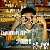
front
(117k)
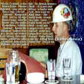
suiting the title, a view of the heimBar shows up as background on the front cover. the keeper has been exchanged by a very happy hühnerkocher, as has the sign above him. his beer pad glasses have been overpainted to show his girlfriend as an optical illusion. beside the half-opaque title typography there's the logo of the kulturinitiative papenburg e.V. with dancing ekkes on the desk. technique: a mask hides the original curtain behind stefan and
lets the heimbar appear. colors had to be turned a few grades to match
the lightening of the environment. the beer pads show four instances
of the same picture of silvie's face, mirrored, scaled and with different
warmth and copy modes. the title uses the monotype
impact font and a trendy low line spacing. the layer had to be
copied to find the right amounts of opacity for brightening and color
boosting, so that it keeps clearly legible without killing the structural
information under it. the subtitle comes less opaque for lower emphasizement. have a glance at six
600dpi details here.(33k) |
|||||||
 |
page
one (106k)
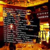
the content of the cover versions folder shows up on a moody atmosphere with dim warm light and even a candle for amorphis' version of "light my fire". typography starts following the architectural structure, but unrecognizedly breaks out to keep the flow and legibility. the cheesy ceilign area has been fold up into a threedimentional table-fussball. technique: fortunately this photo has been taken using no flash.
the warm atmosphere will be lost with every attempt taken to safe ink
by rising the color values. the narrow color field allowes a inverse
copy mode for the tracklisting layer without generating a mess of colors. see also
4 details of page one (50k) |
|||||||
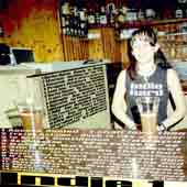 |
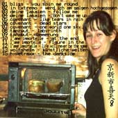
page two (117k)
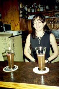
FJ eva is very happy to fridgejockey a very big refridgerator. she
also wears a nice top explaining what the letters on this big refridgerator
are all about. technique: the whole thing was almost but not entirely unsquare
in the beginning. a nonlinear stretch was meant to lead the footage
to 1:1 aspect ratio, preserving eva's 90-60-90. not reaching the goal,
everything had to be streched individually in the end: the fridge, the
bar, the cashbox, and the background. |
|||||||
 |
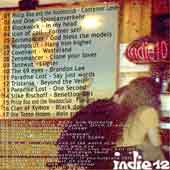
page
three (83k)
blaubär and henne don't miss the framed collection of photos on the wall, that had to disappear on page three to make place for folders six and seven's tracks. the additional information for track fourteen couldn't be integrated in the text block and unfortunately cuts blaubär's throat with the words "killer mix". the tv comes alive to display the folder's names in a typical green bad-tv-signal style. the advertisement space on the ash-tray is still for rent. technique: henne didn't change his sexy bright pink shirt before
collapsing on the bar, so i had to do it for him. again the wooden wall
was replicated before the stamp tool helped me to put away some clothes
that were hanging around on the tv. the dart wall in the background
was short of light so the gradient curves got heavily manipulated in
this corner. check out the resolution in three details of page three (36k) |
|||||||
 |
page
four (79k)
folder number eight's content finds place in large friendly letters (font is fixedsys) on an artificially clearified wooden wall above the baguette-grill, where pretty large baguettes are being grilled. the kanji-tattoo on eva's arm emerges from displaying the characters i-n-d-i-e-8 with a japanese font in windows (indie 8) and by a curious coincidence means "i mixed my first fussfehler when i was 8". the last word in the title of track number 11, "figure in the mirror" got lost during organisation of the available space and was found later reflecting on the desk. technique: after cropping the interesting part of the original
photo and adjusting levels to provide a warm, bright background, some
wall has been replicated to hide two cupboards all around eva. for the
main part the original area has been mirrored, so that shadows and structures
don't show a discontinuity at the border. the typography on eva's arm
has been slightly skewed and shadowed with a dirty dark green color
to express a genuine tattoo-look. | |||||||
 |
page
five (97k)
originally very dark, the background of page five technique: originally dark photo. ha dto be brightened. | |||||||
 |
page
six (100k)
the backSide of the booklet is an alternative front cover. technique: background processed levels, radial blur, waves and
lighning effects. see this detail of page six (27k) | |||||||
|
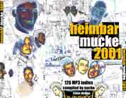
the
cover's backSide (78k)
while the footage for the pages of the booklet was chosen to carry tracklisting typography, the backside was designed to contribute to the protagonists (and antagonists) of the heimbar. in the most cases the footage contained mainly unsexy backgrounds; so the challenge was to construct an impacting ensemble of all these people instead of just welding the footage together or cropping out the heads. technique: the idea was to erase as much color as possible without
loosing the complete background information. the heads remain as hotspots
in a puzzled field of heimbar structures, maybe as some of us remember
them after a long night down there. see these details of the back cover: detail I (21k) - detail II (49k) |
|||||||
| ^ | footage | ^ | ||||||
 |
footage: chosen heimbar-anthems as shown at their own web-gallery.
the applied fonts are |
|||||||
| the copyright of the artwork is owned by melchior blausand. the copyright of the footage material is owned by kulturinitiative papenburg e.V. no reproduction without permission of the copyright owners, except published wallpapers. | ||||||||
| ||||||||