b l a u s a n d [ d o t ] n
e t > graphic projectz > CD cover:m e l c h i o r Mc E l c h ' s f i n e s t I |
||||||||
 frontSide (192k) |
 backSide (78k) |
|||||||
|
||||||||
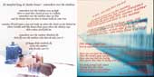
CD cover and 12-page lyrics booklet for a 17-track all-time-favorites compilation.
|
||||||||
 |
page
twelve and front (96k)
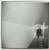
front: the association with christmas, religious content or classical church organ music is absolutely coincidental. technique: multiplied attractors and multiple offsetting. page twelve: the slogan "thank you for choosing" closes
the booklet, showing up on the tunnel photo in it's original black and
white style. in variation to the cover's front, the warm tones on this
page emerge from a third source element, a hand, grabbed from TV. the
hand element repeats the setup of three layers: one has been square-oscillated
to add color and, unlike the front page, emphasize the original's frame.
the second has been cropped and transformed into very three-dimensional
fingers using manual liquidization, affirmed by the equally morphed
lines of the TV-signal. the third has been inverted, vertically mirrored
and oscillated using only two square-waves with extreme different values. have a glance at some 600dpi details: |
|||||||
 |
pages
2 and 3 (98k)
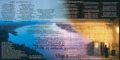
a photo of the river danube is the gloomy enough carrier of the original
hungarian lyrics of song [2], "gloomy sunday". the title is just disappearing
at the horizon, 42 lines realistically follow the natural curve of the
river's flow, leaving the last line "Vége a világnak!" in large friendly
letters at the bottom center of the page, where the river fades on the
second motive, an ancient wall in praha, capital of czechia. the woods
left to the river provide some space for a fantastic german translation
of the lyrics, bright yellow toned to separate it from the general blue-toned
brightness gradient. technique: the montage of the two photos was difficult for some
reasons. the blue river and the yellow wall originally mixed in a ugly
saturated pink. to enhance the color of the area where the wall appears
in the river without loosing much of the wall's detail was only posssible
by creating another adjusting layer. merging the two photos, it took
some time painting different masks to preserve certain contrasts of
both halfs, mainly the dark areas like the slim dark forrest horizon
on the danube photo or the shadow of the toi-boxeson the other. because
of the details of the wall structure, this could not be reached by using
a darken-mode see also
4 details of page 2/3 (86k) |
|||||||
 |
pages four and five (98k)
containing the lyrics of song [6], locusts "noone in the world" and song [7], "so broken" by björk, this page comes up with female grace and an exciting perversion of light and color. like some other pages, the separation has left the straight cut in the center and is found as the border of the left motive, a stonecold contrasted, but carefully colored, very intimate portrait of a woman looking down on those trembling two lines of locust, as they align on the sideboard of the other scene, where color has completely faded. again on a stone background, light casts a horizontal shadow, replied by the sorrowful look of the "venecian woman", that seems to be separated in all possible ways from the other, concentrating on the lyrics of the seventh song, which right-align with the original image's border, and dare to cross the woman's legs, not to cut them, but to separate from the image and hover above it, carefully framing her feet. technique: the gradient curves of the venecian motive have been heavily modified to take out the big shadow's darkness without harming the contrast of the woman. both sources have been simply transformed to fit the 2:1 ratio. some dark glow effect saves the lyrics of "noone on the world". |
|||||||
 |
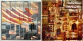
pages
six and seven (94k)
page six technique: this impressing picture of eilan donan castle, scotland, has been rudely inversed to safe ink, slightly color-turned to avoid misfitting, oversaturated blue tones, and exactly mirrored to provide a counterweight to page seven. apart from that the sky had to be streched to perform an almost unrecognizable warm gradient all over the page. the result is a dreamworld castle, far above the clouds, somewhere over the rainbow. page seven technique: continueing the dream theme, a blurry aspect at the port in toronto, canada, has been squared to create a separate partition, only slightly familiar to the opposite page due to some general similarities in color. provoked by the background color, the lyrics appear in neat red, björk following the flight of the port, sting taking counterpart by emphasizing the page's lower corners. check out the resolution in 4 details of page 6/7 (70k) |
|||||||
 |
pages
eight and nine (168k)
the title of this photograph, "die welt ist schön" (the world is beautyful), led me to choosing it as the background for song [16], baz luhrman's sunscreen song, which also helps you with a really remarkable view of life, the universe and everything. technique: the heavy duty of about 420 words could only be contained
on a double page, so the original photograph had to be streched and
mirrored, following the aspect and creating another enveloping shadow
on the right side. see also page
8/9 detail I (70k) |
|||||||
 |
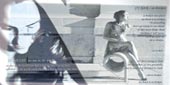
pages
ten and eleven (97k)
the photo of herr krossi evaporates pure happiness, like everybody who has listened to all the seventeen songs of melchior McElch's finest I. it seems that he has found what signor rossi is looking for in the lyrics of la felicitas. page ten technique: according to the theme this page is allowed
to make use of another font:
comic sans. that allows the handdrawn lines of the lyrics to
better integrate into the whole thing. while this line in a childish
way stresses the shape of herr krossi's head, the layouted part of the
lyrics conserve as much of the background as possible, providing a wide
gap where the eye of herr krossi appears, and using a white color, which
also mirrors the color relation of the opposite page. see also a small detail
of the tracklisting (30k) |
|||||||
|
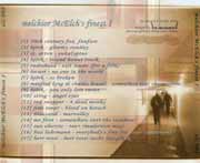
the
cover's backSide (78k)
the photo of the tunnel behind niagara falls, canada repeats on the backSide of melchior McElch's finest I. this time, it has been encolored only slightly, again with a warm tone, to carry title and tracklisting information in a complementary grey blue. again a copy of the tunnel photo layer has been square-oscillated and brings up geometric appearance. some characters of the tracklisting had to be manually brightened to stay legible in front of the dark floor. the words "over the rainbow" come to lay over the brightly shining ceiling of the tunnel. carefully adjusted shadowing effects and a hard light-mode make the typography seem to be softly stamped on the canvas. see this a detail of the back cover (39k) |
|||||||
| ^ | footage | ^ | ||||||
 |
footage: 10 photos by alexander fekete. manually cropped supermarket bill. 4200 modulated characters of monotype corsiva.
|
|||||||
| the copyright of the artwork is owned by melchior blausand. the copyright of the footage material is owned by alexander fekete. no reproduction without permission of the copyright owners, except published wallpapers. | ||||||||
^ |
see
also the
© blausand - last update: |
melchior McElch's finest I audio-page. mon 28-oct-02 15:38 |
||||||