b l a u s a n d [ d o t ] n e t >
graphic projectz >
CD cover:blausand örliwörx | ||||||||||
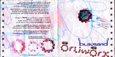
 Inlay (80k) |
 discPrint (40k) |
 backSide (103k) |
||||||||
|
||||||||||
CD cover and 16-page booklet for the blausand debut album.
|
||||||||||
 |
page
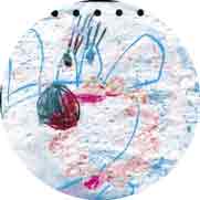
sixteen and front (103k)
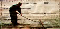
front: a kid's painture, found on severinstreet in cologne, matches to give birth to the front cover of my debut CD blausand örliwörx. the black dots on the left and right side are originally from the sourc, which was painted on a 70ies computer paper. the second source is a scan of three toy revolver ammunition rings, found on the street everywhere on carnival. the credits on the backside become legible if you click on the thumbnail picture. technique: harmless as the material. some colour correction. have a glance at some original resolution details: |
|||||||||
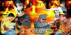 |
pages two and three (87k)
"ata - the penetrator" is a video movie from 1994,
shot at a house party in oberdürrbach. from some existing photo
stills, this movie poster has been arranged. it shows up four scenes
from the movie in front of a generated fire background.
see also some enlargements in |
|||||||||
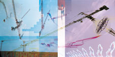 |
pages four and five (121k)
the kran page consists of three pictures of berlin 1998. you can see the horsewaggon of vistory on the brandenburg gate, once aligned on top of the building site fence and once upside down in the gap of blue sky column. technique: multiple streching and skewing. elephant trunc style kran with stamp tool. some skewed typography on the fence saying "pity they're gonna leave. they are so beautiful". see how it really looks like at |
|||||||||
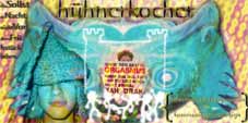 |
pages six and seven (77k)
guess what the turquise thing in the back is? i added a generated pattern in the background. and pasted two pictures and a name typography of the chick cook, the logo of his favorite bar and two very important statements of that time. technique: heavy colour-treatment of the sources. masking, different copy styles. the typo consists of two layers (one with motion blur) and photoshop effects. check out the resolution in this detail of page six/seven (71k) |
|||||||||
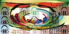 |
pages
eight and nine (56k)
technique: 5 instances of the "glasses"-footage, color-phased by 5 angles align in 5 columns. the whole thing is transformed from kartesian to polar data. at the top, the original glasses appear once more, blended with the blausand logo. 21 instances of the "headphones"-footage have been processed in color, saturation, brightness and contrast. some of them are masked, some of them are invisible. "noize of today - muzig of tomorrow" appears in a two line typography, using dunno what font, a streched copy of the layer is underlaid and masked where necessary. see also page eight/nine detail I (23k), detail II (51k), and detail III (58k) |
|||||||||
 |
pages ten and eleven (95k)
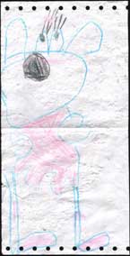
this is an example of perfect harmony. the original form used in my high school for excuses is burnt into a magazin illustration of a japanese monk preparing the stone garden. the framing spell has a source no more trivial than my own brain. technique: not much. was a bit of a struggle to manage good readability for the start and the end of the spell, but the rest is just "color burn". see also three details of this page (53k) |
|||||||||
 |
pages
ten and eleven (84k)
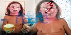
i apologize for this page. as the chick cook page, it shows one of my best friends, fluidly speaking koptic egyptologist, genious travelling together photographer and starting to travel more anybody else could afford archaeologist alexander fekete. normally, he has neither an irritating squirl in his face, nor greek joghurt. almost, but not quite entirely unlike these photos, his look does NOT remind you of aphex twin. technique: a few parts have been enlarged and color values distorted to dissect from the body and give birth to that aphex twin / come to daddy style...typography #1 is handpainted, as everybody can see. #2 is melt together by using photoshop effect layers. #3 consists of a single "z" and the rest of a very smashing statement: "somehow, ten years were enough for this planet's animation program to be in- and exhaled." see also this detail of this page (53k) |
|||||||||
 |
pages
ten and eleven (95k)
the footage is a photo of a selfmade lamp that unfortunately no longer exists. the color values have been adjusted to that blood dark red background and a very saturated and contrasting blue shining. a tracklisting appears bowed to the left, and it's stirred mirror-page bowed to the right on the opposite side. the blausand-logo seems to belong to the footage, though it's copied in. technique: extreme colour emphasing levelling. several typography layers with photoshop effect layers, rendered, bowed, copied, mirrored and stirred, not shaken. see a reasonable high quality version (185k) of this page, preserving fine structures. |
|||||||||
|
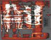
the
cover's backSide (103k)
the barcode is from a foreign generator program. the footage is three toy revolver ammunition rings laying in my scanner. see this detail of the back cover (32k) |
|||||||||
|
the
cover's backSide (80k)
guess what that is? a coca cola automat covered with flyer bills on a backyard in toronto, ca. it's been slightly streched and, in order to save some ink, black parts have been brightened to 50%. |
|||||||||
|
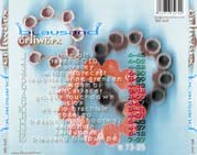
the discPrint (40k)
showing an excerpt of the cover again. |
|||||||||
| ^ | footage | ^ | ||||||||
 |
| |||||||||
| the copyright of the artwork and of the footage materialis owned by melchior blausand. no reproduction without permission of the copyright owners, except published wallpapers. | ||||||||||
|
||||||||||